Friday, 11 May 2012

Showreel and Reflection


In a previous group tutorial I had talked with my tutor about how it would be best to approach the show reel and the result was a few pieces of advice:

-Keep it focused

-Use Artwork to back up gameplay footage

- Try to maximise sheet space and show everything.

I kept all of these in mind when it came to constructing my show reel in iMovie. Originally I had planned to use After Effects but when I arrived at the media lab it was entirely full which meant falling back to iMovie – which proved to be a happy accident as it was perfect for the show reel and very easy to use.

(Recording the video)

Recording gameplay footage was actually a substantial amount of hassle as far as finding reliable screen capture software and actually led to an entire day almost being wasted without video being recorded. At first I believed that machinima friendly ‘Fraps’ might be the answer, so I downloaded it only to discover that it would only record in game…and by that I mean in a full release title such as Left for Dead. This was immensely frustrating and led to a Google/ YouTube fuelled hunt for software to do this properly.

Through trial and error with DuckCapture (which proved to be simply more advanced print screen…) and CamStudio (Littered with bugs and made my screen go weird often – in addition to recording in poor quality), I found Microsoft Encoder. It did have its own issues (recording in sound for example) but nothing that was fatal. At the end of this day I managed to record footage of both my levels in addition to a brief play through of my point and click ready for the next day.

Here is the finished Showreel:


And also as promised the link to the Portfolio Website:


On Reflection…

Aside from making an offline mock up using screenshots for submission purposes I have finished both Project 2 Tasks. I feel happy with the portfolio as far as core layout and look – with the feeling that with more impressive work behind it this can only get better as I grow as an artist. The Showreel is something I’m very happy with also, with my only issues perhaps lying with the quality of some of the gameplay footage – but this is down to the quality of the recording which could not really be improved. Although, out of the two, I can see myself returning to the Showreel to make larger changes in the future.

On reflection maybe this was due to the issues with project 1 (in addition to external projects) bleeding across into the time planned for this project not leaving me enough time to be as happy as I could be with the Show reel but I am nevertheless satisfied with the outcome.


Project Bibliography:

Juno’s Online Portfolio:

Maxx’s Online Portfolio:

Jason Chan’s Online Portfolio:

(All of the above visited: 05/05/2012)

Monday, 7 May 2012

Portfolio Design


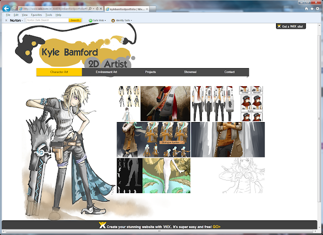
For the actual creation of the portfolio website I decided to use Wix.com – a free drag and drop style website maker that allows the user to create galleries of images and import movies among other features. I thought at first that I might use a free template so I mucked around a bit with that to get to grips with what I could do with my site before starting again on pencil and paper to get a simple plan made of how it would be laid out.


The composition, layout and content I considered very carefully as the phrase ‘’three button rule’’ was used in the introduction to the brief – essentially meaning that the visitor must be able to get to what they want to see in three button clicks. By dividing my pages up into Environment Art, Character Art, Projects and Contacts each section is clearly labelled and the galleries of images are laid out to abide by the ‘L’ composition to make the pages each look aesthetically pleasing, with a decorative design in the bottom left.
Projects page design

Final Version


When it came to constructing the pages themselves in Wix, I created or altered existing artwork to make the pages as I went. I also utilised a dark grey, light grey and a gold colour in order to create theme between the pages with a strong title at the top (my name and role). The Result is a little different from my page plan but I think it still retains the clarity, content and core composition. I still have to create my show reel so haven’t published the site yet but I will post a finished link when it is finished.


Saturday, 5 May 2012

Possible Portfolio Items


Character Art


Backgrounds


Projects:


- Interactive Narrative Comic: Orion's Gambit
- Zork: Point and Click
- Page Turners Demo

Portfolio - Research

In order to create my online portfolio I decided to look at a few different portfolios to get an idea of what I could do for my own.


Notes:

Pro’s
Sounds work

Negatives
Takes too many button clicks to get anywhere
Too simple
Images aren’t big enough

For this one I felt that the design was too simple and wasn’t immediately engaging me with artwork. It took a few clicks for me to get to each area because of the precision of what the artist was displaying. I think that it works as a portfolio but I can’t find any inspiration in the design.

Maxx


Notes:

Pro’s
Clean look
Very easy to get to the artwork

Cons
Can’t think of any

Sections
 Illustration, Character Creature, About, Contact

I thought that this portfolio worked very well as far as clarity was concerned, it clearly presented the work under broad banners with a level of precision. I couldn’t think of many issues with this site and as a no nonsense portfolio it definitely acts as a perfect example for me.


Jason Chan


Notes
Blogspot design, works well, all the art is very easy to access with a nice title page with access to contacts at the top of the page.

This site really jumped out at me when it was shown two weeks ago, but I couldn’t find the original website. Even so the blogspot design worked. It wasn’t over packed with needless detail because the artwork told the story. It allows access to contacts as well.  


Next step

From this research I’m now going to organise the artwork that I will be using for the website  and look at Wix, which is a free website builder in addition to Blogspot as possible options to create the portfolio with.

Friday, 4 May 2012

BA6: Focus 3 Bibliography

 
Documentary Definition. Available from:


Assassins Creed: Limited Edition Art book (2007) Prima Games 

Extra Credits (2011) Facing Controversy. Available from:


Daniel Starkley (2011) Interview: Six Days in Fallujah


Fox News (2011) Six Days in Fallujah News interview. Available from:
(Accessed 28/04/2012)

Daily Mail (2009) Iraq War video game branded 'crass and insensitive' by father of Red Cap killed in action: http://www.dailymail.co.uk/news/article-1168235/Iraq-War-video-game-branded-crass-insensitive-father-Red-Cap-killed-action.html (Accessed 28/ 04/2012)

Guardian (2004) JFK Shooting game ‘despicable’. Available from:
(Accessed 28/04/2012)


Gamespot (2009) Six days in Fallujah interview. Available from:
(Accessed 28/04/2012)
 
Stuart, K (2009) Konami pulls Six Days in Fallujah. Available from:
(Accessed 28/04/2012)

Wikipedia (2012).Six Days in Fallujah Overview. Available from:
(Accessed 28/04/2012)

Game Politics.com (2009) Gamer War Vet Fears That Six Days in Fallujah Will Dishonor Those Who Served in Iraq. Available from:

Will Wright (2011) Inventing the future of Video Games Keynote. Available from:
‘FancyJakeOnline (2012) The Kite (English) Complete Playthrough. Available from:

Wikipedia (2012) Social Realism. Available from:

Henry Jenkins, Reality Bytes: Eight Myths About Video Games Debunked. Available from:

Jiyeon Lee (2011) South Korea Pulls plug on late-night adolescent online gamers. Available from:
(23/03/2012)

Eliot Lefebvre (2011) South Korea puts the ‘Cinderella Law’ into effect. Available from:
(23/03/2012)

(23/03/2012)

Spiral Knights Screenshot. Available from:
(23/03/2012)

Animal Crossing Screenshot. Available from:
http://guidesmedia.ign.com/guides/682878/images/acww_02_money_06.jpg
(23/03/2012)

Raphael Row (2010). Can video gaming cross from innocent fun to addiction? Available from:
(23/03/2012)

The Kite (Anate Studios, 2012)
Animal Crossing: Wild World (Nintendo, 2005)
Spiral Knights (Sega, 2011)
Assassins Creed (Ubisoft, 2007)
Doritos Crash Course (Wanako Games, 2010)
Darfur is Dying (Take Action Games, 2006)
Madrid (Newsgame 2004)
September 12, A toy world (Newsgame 2003)

Thursday, 3 May 2012

Ba6: Focus 1 Reflection and Bibliography

Like the previous projects, Ba6 focus 1 has been very beneficial and I feel I’ve grown in a number of different ways. At the beginning of the project I had not really used Stencyl much, having hoped to use it last term but in the end not having enough time. However after having worked with the software for that past two months, I have begun to understand how to achieve not only sidescroller genres but the creation of other games which is something I am going to explore further in my free time. Of course, Stencyl is not entirely perfect as I discovered with the error that appeared when my game became too big so this has made me doubtful of whether I shall use it next year.

That error with the software also leads to one of my biggest frustrations with the project – that I couldn’t create more levels, add enemy characters and debug the small non crucial issues with the game (Wall jumping for example does not run as smoothly as I would like at times) because I spent that planned time in fact rebuilding all of the previous months work.  Nevertheless though despite not having enough time to achieve more than I would have liked, I certainly feel as if I have created all that I wanted to, in a high enough standard.

Furthermore I feel as if I’ve grown as an artist and designer by applying my art in a physical sense rather than just as concepts. Despite this though I did create a singular piece of concept art just to round of the project and add to my portfolio.

Finally as the project has been about specialism, I think that at heart I would like to remain a 2D artist, which is a broad statement as the industry is built upon a number of distinct roles be it environment, character design, assets, commercial artwork, etc. However ultimately something which I have felt at the end of each project is a sense of enjoyment and growth no matter how I’m creating art – be it the silhouettes and iterations of BA4: Focus 2 or creating assets using a fast workflow so I would be happy in any role involving 2D art. If I have those kinds of feelings all that I need to work on is advancing my core skillset because I still think my artwork has a long way to go before I’ll be ready for the industry so this will be my next step over the coming year.


Project Bibliography:

Outland Gameplay image. Available from:
(Accessed 24/05/12)

Bastion Gameplay Image. Available from:
(Accessed 24/05/12)

Bunny My Honey cover image. Available from:
(Accessed 24/05/12)

Spyro the Dragon 2 Gameplay image. Available from:
(Accessed 20/03/2012)

Limbo Gameplay image. Available from: http://media1.gameinformer.com/imagefeed/featured/microsoft/playdead/limbo/limbo610.jpg
(Accessed 20/03/2012)

Little Big Planet Gameplay image. Available from:
(Accessed 20/03/2012)

Apple Jack Gameplay image. Available from:
http://blogs.dailyrecord.co.uk/gaming/upload/2010/08/apple_jack.jpg
(Access 20/03/2012)

Hotel Dusk: Room 215 gameplay (2007). Available from:

Eden of the East Ending (2009) Available from:
(Accessed 20/03/2012)


Wednesday, 2 May 2012

Disaster and Turnabout


Unlike my last posts which have been slow due to maximising progress on the game, this has been down to a huge issue that has reared its head in the last week in that the game that I’ve created refuses to export to a format which could be handed in. This is immensely frustrating as I had completed my tutorial level, and was a cutscene away from completion. 

The issue is stated down as a problem with incompatible sound files but after they were removed the problem remained. In the end I had to amputate most of the assets and levels for it to disappear but soon it became apparent that the game itself somehow had become fundamentally broken, meaning I had to remake it from scratch.


Some example screens of the tutorial cutscene
Full Tutorial Level


This has been beyond frustrating but now I completed a Tutorial segment (with an additional cutscene) in addition to the first level. I have re-made Mira and altered the way she moved so that it looks like she is learning to walk as this wasn’t apparent in my previous game versions and my next step is to update her Indian form to be distinctly different from her base form – something which wasn’t apparent in the peer group session I had. The Updated design plays upon the clichés of ‘Cowboys and Indians’ with the headdress and poncho being key icons in the design. She also is red and bright meaning that it would be impossible not to see the difference. I simply need to resize the images and place them into the game to finalise Mira.


The last touches that need to be done to the game is the complete rebuilding of level 2 – which will have to be done in a new file, meaning that the first and second level segments will be separate. This is not ideal but I discovered that after a certain amount of assets are inputted into the game the deadly issue that destroyed my previous work appears so this has now became unavoidable. However, with this though the internal workings of the game have become much more fluid and streamlined and the game does not lag or struggle as much as it did previously.