Showing posts with label Ba4: focus 2. Show all posts

Sunday, 27 November 2011

Unit 2 Bibliography

Unit 2 Bibliography

Veejuu, “Fox Nicking Gooseberries” (2008) Available from:
JCFox1, “Happy Fox” (2007) Available from:
Toon, Anne and Steve, Fox photograph. Available from:
Fox Photograph, Available from:
National Geographic, Wolf Hunting Tactics (2009) Available from:
animalattractionstv, “Wolf Growl” (2008) Available from:

(All of the above accessed 06/11/2011)


Various Leather Jacket Images. Available from:
(Leather Jacket images accessed 06/11/11)

Frank West image, Available from:
http://media.giantbomb.com/uploads/0/3421/205899-frank_west_large.png
(accessed 24/11/11)

Persona 4 Yosuke Expression Character Sheet, Available from:
(Accessed 24/11/11)

Spawn ‘Redemption’ cover. Available from:
Assassins Creed Concept Art, Available from:
Assassins Creed: Revelation’s Concept art. Available from:
(Accessed 24/11/11)


(Accessed 26/11/11)

Garrett, Patryk .Mass Effect 3 Fan Art (2011) Available from:
(Accessed 27/11/11)

Games Referenced:
Valkyria Chronicles (Sega, 2008)
Persona 4 (Atlus, 2008)
Ace Attorney Series (Capcom, 2001 - Present)
Hotel Dusk (Cing, 2005)

Analysing Light in images

M.C Escher, Hand with Reflecting Sphere, 1935

This image is the perfect example of reflection of light across a curved surface. Due to the ball’s spherical nature, the reflected light distorts and stretches the reflection, increasing as it progresses further from the centre point. This is most noticeable when you compare the figure in the centre to the shelving in the top left of the reflection.
In the reflection, there is the presence of bounced light from the windows, illuminating most of the right side of the room.  Because of this and the distance from the light, the shadows around the walls are undefined for the most part – although in particular around the chairs and shelves, the shadows are harsh and defined.
Aside from the reflective ball, the hand is being illuminated from the right. Due to the intensity and sharp contrast of the shadow/ light across the hand, the light source is likely to be a lamp that is close to the hand.  This could also be seen by comparing the shadow on the little finger with the shadow of the following fingers. It becomes much more undefined in nature and a lighter gradient to the defined and more intense shadow around the folds of the little finger, illustrating that the light has a high intensity/ close radius.
The background gradient of the image is likely to be more a compositional choice than a realistic one – with the dark tones at the base of the background contrasting and ultimately framing pale tones of the hand. Conversely, due to the shadow increasing progressively from the right window of the sphere, for the most part, the pale top background tones create a clear definition of the sphere’s weight and existence within the world.

Mass Effect 3 (Miranda) – Patryk Garrett, 2011

Bounced light and colour is a large part of what makes this artwork work. The figure of Miranda is the focal point of several different colours/ light sources reflecting and contrasting. The overall colour palette of the ship can be considered cold – with varying degrees of blues and greys making up the metallic forms. This reflects on the skin of Miranda and is especially prevalent in the shadow covering the top half of her face, and her legs (the most intense light on her leg most likely being a bright blue/grey than a white or pale skin tone). Even her black t-shirt is absorbing the blue palette slightly.
However one of the most intense aspects of the image is the contrasting nature of the hot colours radiating from the Tech arm. The light that it is giving off is so intense, that it reflects brightly from the black t-shirt that Miranda wears – which does not have a reflective surface (as proven by the absorption of most of the blue light within the area. The intensity of light given off by the tech arm influences the colour of the metal it is resting on in addition to the bottom of Miranda’s leg.
Another light source exists in the image beyond the tech arm – and this is coming from the top right of the image. It can be seen at its most intense on the metal beam top right (which then reflects down on the leg/ bottom of the black t-shirt) but it extends across the image, illuminating the mouth and shoulder of Miranda  - in addition to the metalwork behind her.  At the points where it hits the skin, the colour palette becomes warm, whiles when it hits the metalwork behind her head, the cold palette remains.
Jeong Juno, Novel S.K.T cover illustration 2003

Page 52, Japanese Comickers 2 (2006, Collin Harpers Design, New York.)
The light for this image is natural, and unlike the last two images, this source has almost a universal effect on the tones. The colours and light established within the sky in the top third of the image influence the pale buildings and rocks in the background – obscuring the solidarity of the scaffold like structures in the horizon. As the light hits the back of the car, it reflects of the surface, dominating the area and background around the car. As the image progress to the foreground, the bonnet of the car is illuminated (at its most intense along the left of the image). In the more intense areas of light, again the colour palette of the sky is evident in its influence. On the skin of the character in the centre of the image, the light is reflecting from the muscles and curves of the left side. The character to the right has a skin tone that is not largely influenced by the light source (only noticeably in the higher cheek area). Instead, his hair and coat absorb most of light (creating at points sub surface scattering between hair strands). The black elements in this image (the Jacket, the t-shirt, the trousers and chains) do not absorb at light much. Only at points where the light is intense, such as the right characters shoulder, will the light begin to affect the colour of the jacket to reflect the colour of the light.
The shadows in the image are most prominent on the car bonnet, where both the characters have a shadow reflecting from its surface. Dynamic occlusion can be seen in the slight changes in tone from the shadow of the right character – as the shadow closest to his leg becomes lighter and sinks into the tones of the car window as it gets further from his body and the point for which the shadow is being cast.
Sources:
(accessed 26/11/11)
http://gods-of-art.com/mass-effect-fan-art  Patryk Garrett, Mass Effect 3 Fan Art. 2011
(accessed 27/11/11)

Wednesday, 16 November 2011

Model and Character Sheet preparation

The past few days have been full of experimenting with various different elements until the final character was completely designed and ready for the Model/ Character Sheets.
Lantern design
Early in the conceptual stage, after creating the silhouette with the hanging lantern, I began to research and sketch different lantern styles. I returned to those sketches and created a Hybrid, should the player have a hanging lantern attached to their hip:

Bag design
I knew for the character a messenger bag would be most suitable so, like with the lantern, I sketched a few designs before creating a hybrid of the three:

Jacket design:
I felt that the basic Jacket the character wears was perhaps too simple so researched several different jackets; sketching a few before colouring them. I lined them all up and altered the hue and saturation to find the design and colour I wanted for the model/ character sheets.

Facial expressions:
Given how bad the frontal image of my character had turned out in the colouring practice I created several faces based from the successful character sheets I had made earlier. However I felt there was something that wasn’t quite right with the length of the hair so experimented with a shorter hair style and also on a design that lacked a scarf. After speaking to a number of people I decided on keeping the scarf, but having the shorter hair.

Bag logo design
This wasn’t something I had thought about much, but I wanted to give the character a bit more depth and the way I was going to do this was via the space on the protagonist’s messenger bag. The thoughts on the characters profession had changed quite drastically since when I was considering a freelance journalist and had moved towards a trainee doctor/ nurse. Because of this his hospital’s logo seemed suitable, but I didn’t want the nature of the logo to be too obvious that he was a doctor – as the protagonists details, like those of the other NPC’s in Zork, should be something that can be discovered.

I looked at a few different hospital logo and themes that I could have based the design around before settling on the theme of ‘Icarus’ – the character from Greek mythology. Of course the role of Icarus is a tragic one – flying too close to the sun and melting the glue on his paper wings, but I wanted the wings to be the focus of the design, and be something that is shown in some way in the design or on the player’s badge. This would be more for the connotations of angels and in turn Benevolence, hinting that the character can be a good person. Conversely, when the player becomes antagonistic, that badge would be ripped off in the final act of whomever the player kills to become antagonistic, creating a tear in the beanie, revealing messy hair that sticks up in the shape of a horn.
I did a few basic sketches of the design, before bringing it into Photoshop to create the final design.


Now that I have completed these steps, I have a settled character design that I can encapsulate in my model sheet and from that my character sheet – both of which are my next goals.

Monday, 14 November 2011

Colour work


After the lecture on lighting I decided to colour my character focusing on lighting. For the legs and jeans it really worked and there was a good sense of single source light and depth to the drawing, but glaring issues with the face really hindered my progress so I didn’t complete it to that standard everywhere else. Still, instead of simply dumping the image, I made some rough notes on what needs to be done or what could be changed to the base design – identifying the bag, the hanging lantern and his Jacket as points which needed to be explored further. Additionally, my attempts to make the face slightly more realistic looked awful and really didn’t suit the rest of the design so I need to also look at the facial details in more depth.

A colour mid shot version of one of my character sheets, highlighting that in comparison to the top image, perhaps a simplier facial/ tonal colouring method might be best.

Saturday, 12 November 2011

Change in direction

Despite my work on a female protagonist I still felt drawn to one of my initial thumbnails and decided to do some work on fleshing it out and seeing where this might take me.

Using Paint Tool Sai’s pencil tool, I roughed out a basic design, adding a checked shirt in place of the implied t-shirt in the silhouette, in addition to little touches like a singular hair flick (the fox ear) and a bird feather on the bag. I really like the rough result and it is making me doubt the path I am taking in creating my protagonist so I did some more work on the actual face of my character – settling on this:

Given I had created this on thin paper, I used it as an underlay and created a succession of character sheet expressions; ranging from Happy and angry – to Terrified and antagonistic. From these it was clear that not just a design but a character was emerging from this work very quickly. At this point I decided that this was actually going to be my protagonist character.
Anger - the hair flicks across the right of his face are much more jagged and aggressive than his standard pose to show the change in mood.
Disgruntled/ Bemused - I really like this expression because it really encapsulates those feelings - especially due to the drooping hair flick that really adds to the protagonists character.
A conventional anime smile - given the situation that is plaguing all of the characters in Zork, the player would only see this in rare, fleeting moments of funny dialogue or endearing occurrences.
The 'neutral' pose for the character - whenever he is listening or talking he will hold up the scarf in front of his face.
It is here where the anime style of the character really aids in conveying the expression of terror. The hair once again changes to suit the character's mood - sticking upright due to his alert status.
For this I had the hair droop slightly due to interference from the hand and because the character was deep in concentration - relaxing the hair 'ear'.

In the game since the character can become the antagonist due to the players actions I needed to find a way to make him more antagonistic - the shadow, creepier smile and changes in hair flick to seem more a kin to a horn than a fox ear were really good signifiers that worked to create an antagonistic look. Given the idea of trust and shadow in the game as a theme, I think the idea of including shadow across the players face instead of NPC's faces is an interesting subversion of that feature - perhaps hinting to the player that they dont know their character as much as they thought they did.

I had fun creating this and it was just an extra expression. In zork there would be a number of pointless but humourous actions that the player can take - one of which would be to put a bucket on their head. This would initiate a funny - slightly 4th wall breaking scene where the character would hint that perhaps some controlling force (the player) is at work.

Friday, 11 November 2011

Why Anime?

One of the most important aspects of Zork would be to create the right atmosphere, with the characters and their personalities at the foreground so a conscious design choice I made when designing my character for Zork is that it would be undoubtedly influenced by Japanese graphic novel art. This wasn’t simply a choice made via personal preference but rather in that the Japanese Anime/ Manga style excels at conveying expressions – be it extreme or minor. Many video games that utilise sprites and focus on the characters emotions are often portrayed in an anime style – such as Hotel Dusk, the Shin Megami Tensei: Persona Series and the Ace Attorney series. This is something that would occure in Zork aswell.

The character sheet of Yosuke in Atlus's Persona 4. The anime facial style conveys radically different expressions and atmospheres, even if the pose of the character doesn't change - highlighting the power of the Japanese 'Anime' Style. A possible influence for my character sheets.

(Accessed 24/11/11)
Frank West - A character who florishes in the role of a freelance Journalist/ Photographer

From the fleshing out thumbnails I really liked the idea of creating a freelance journalist character – in a similar vein to Dead Rising’s Frank West. One of the greatest aspects of having a freelance journalist as a protagonist is already several important character traits are apparent just by this profession:
Independence, A need and desire to find the truth, courage, camera/ documenting equipment (a camera often becoming an integral part of gameplay mechanics such as a means of levelling up frank west in Dead Rising or the main weaponry in Project Zero), persistence  and cunning.
There are other little aspects to having a freelance journalist protagonist in Zork – namely that saving can be tied to a notebook that he/ she might carry and the action log too can be tied to this. Also that could be tied to the characters reason for being kidnapped (maybe reported on something in a bias fashion, got too close to the truth in a real life investigation, ‘snooping nose’ where it doesn’t belong, etc.)
I also looked at expanding my design ideas for the costume, borrowing ideas from my thumbnails by also other influences on the internet for possible clothing. The result of this was:
I think she has a certain level of confidence just from the sunglasses on the head, leather jacket and red muffler scarf. The sunglasses (not drawn correctly but this is only a basic concept) are useful in giving reason for the fox ear flick and the ‘whisker’ ear flick in the characters hair that give her a subtle fox look – although I would  alter the ears on a second iteration.
I looked at a few influences and costumes when creating this:
Jackets:
(Accessed 06/11/11)

Frank West image
http://media.giantbomb.com/uploads/0/3421/205899-frank_west_large.png
(accessed 24/11/11)

Thursday, 10 November 2011

These are just a few different female hairstyles the protagonist could have. Most of these aim in some way to reference the features of a fox – be it the orange colour, the ears or bulbous tail that is white tipped. My personal favourite would be the bottom row middle hairstyle because it isn’t to explicit in the fox link yet the ‘ears’ are present and the tail is referenced at the base of the hair.
The ‘flick ears’ wouldn’t just be for show – like a fox I think they should change depending on the mood of the character. This very early and quick sketch I created just in a few minutes whilst researching foxes to get down this concept onto paper.

Tuesday, 8 November 2011

Basic design Thumbnails

From my silhouettes I picked 10 that I liked and from that three that I wanted to make very basic thumbnails from. Most of the thumbnails below were based around the concept of a female protagonist which was interesting. I tried to vary clothing and in a few cases gender to get a wide range of Ideas down in the thumbnails.
My thoughts:
Thumbnail 1: The large neckerchief and baggy shorts under the skirt were the most interesting part of this. I also liked the hair and of the boots worn by the other thumbnails, I think that this was the right size and design.
Thumbnail 2: Keeping it basic with a simple scarf and sweater. However I don’t know if it would stand out as a player character and in addition there isn’t the fox/ wolf influence that I would have liked
Thumbnail 3: I went for a male character here, which was difficult in the constraints of the silhouette so the jeans hang low (to fit the shape of the skirt). I really liked this thumbnail as there was something about it that makes it seem more ‘absolute’ than the others. A definite contender
Thumbnail 4: similar to thumbnail 2in simplicity but I tried to make it more interesting with the bag, boots and hair. Not really seeing the protagonist in this design. Again I think maybe it might be too simple, although simplicity is often one of the traits of a protagonist design wise.
Thumbnail 5: my original concept when drawing the first silhouette, the idea of two long overly baggy sleeves, the long boots and beret/ beanie was all the reasons for the silhouettes shape. I do like this one but it oddly doesn’t share the impact of thumbnail 3 for a protagonist. I do think though, that it could be a basis for another ‘player’ in Zork.
Thumbnail 6: More explicitly influenced by a wolf, this one was more aimed for another character other than the protagonist (namely ‘Syo’). The idea that she looks like a normal person but is wearing a large oversized wolf hat is subverting the idea “A wolf in sheep’s clothing” to be the opposite – “A sheep in a wolf’s clothing” to hint that while she seems like danger, in actuality she is not at all.
Thumbnail 7 (Original Silhouette)
Thumbnail 8: Given the shape catered for a skirt, I tried to vary the clothing for other forms that fit the shape and the poncho was born from this. It’s interesting but again doesn’t really stand out to me.
Thumbnail 9: Was trying another male character with this one. The shabby hair and untidy business/ school wear was very archetypal of anime style characters (i.e.: Battle Royale) but I want to deviate slightly from what has been done before and create a character that is unique in its own right.


The next bout of thumbnails were interesting because out of the silhouettes I had created, these had one of the most dynamic poses and had the interesting feature of a lantern that hung from the characters torso.
My thoughts:
Thumbnail 1: futuristic looking with the goggles and clothing. Actually liked this, but I don’t think the character should show as much skin and maybe should wear clothing that would perhaps be more suitable to the tasks they are fulfilling.
Thumbnail 2: going with basic business attire like thumbnail 9 of the previous batch, creating a Shaun of the Dead style look. I don’t think the silhouette proportions necessarily fit the character.
Thumbnail 3: I like this one with the short sleeved hooded sweatshirt, converse shoes, jeans, skirt and Z design on the t-shirt. Furthermore the hair flicks hint at ‘ears’ like that of a fox. Not necessarily going to be my final design but from this I am seriously considering orange hair and some kind of hair flick as possibilities for a fox influence on the character.
Thumbnail 4: I experimented on the bottom half variation a little, with short boots and rolled up jeans under the skirt. This really didn’t stand out to me, but I did like the top half with the black, leather like jacket, short red neckerchief and shorter bag. A possible contender for further conceptual work.
Thumbnail 5: Valkyria Chronicle’s heroine ‘Alicia Melchiot’ was a definite influence with the head scarf and brown hair. The torso bag was probably one of the stand-out points of this design.
Thumbnail 6: I really liked this thumbnail because it put across a character more than a design. I could see a freelance journalist in my mind from just looking at the image and from that I had ideas about how I could tie this into the story. I think out of all of the thumbnails so far this was probably the most thought provoking.
Thumbnail 7: Really pushed the fox influence with this in the hat and pony tail. For the actual costume design, I liked the simplicity of this and the stand out nature of the neck scarf. It reminded me of my original Zork concept to have each ‘player’ wear a bright red piece of clothing.
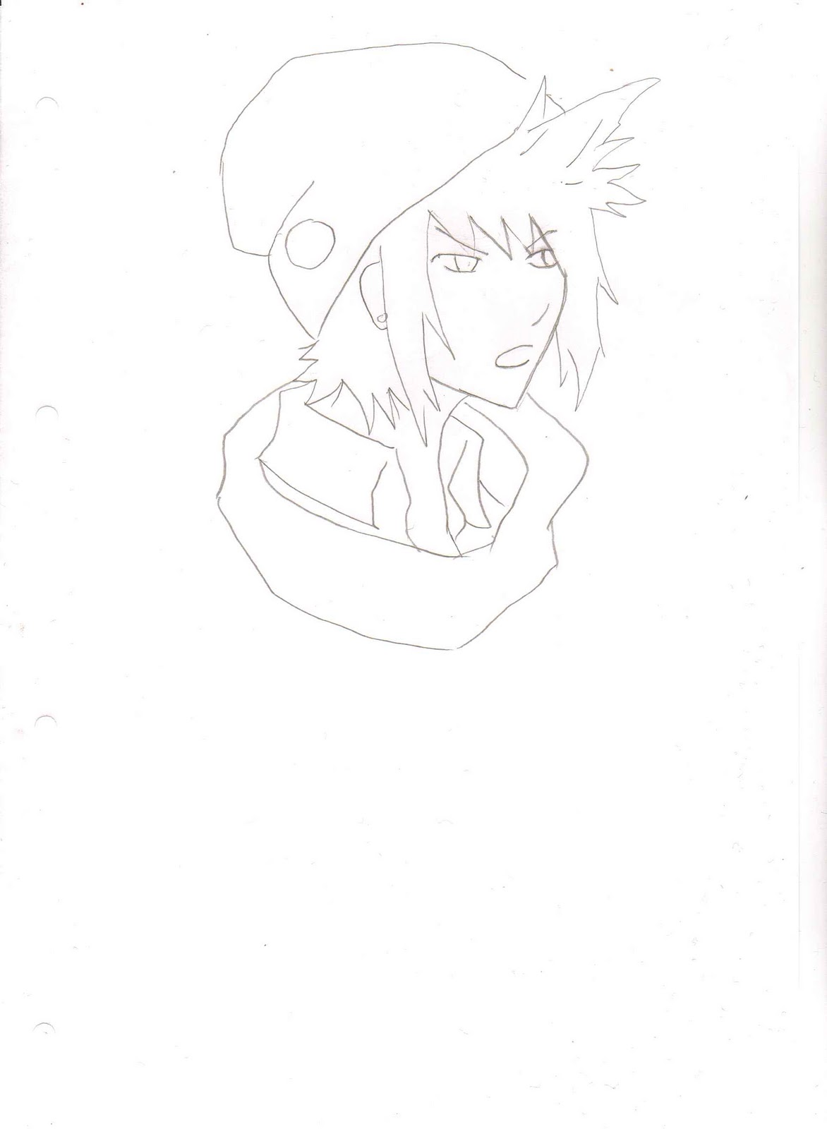
The final few thumbnails were from a silhouette that was actually inspired by someone I know, when it came to the stance and hood with ears. Because of the stance this silhouette was somewhat restricting, so I only did three thumbnails.
My Thoughts:
Thumbnail 1 (Original Silhouette)
Thumbnail 2: The original concept that came to mind when creating the silhouette.
Thumbnail 3: This was similar to my original idea of what Syo would look like when designing the concept of Zork initially. I think the bright white hoody and neckerchief work well together although there wasn’t much room for deviation in the bottom half of the thumbnail.
Thumbnail 4: experimented with a fox like hat and simple design for the rest of the costume. I think this actually works quite well although I don’t think such a focus on headwear suits the protagonist character – there should be a balance all over the design. However for a possible NPC this could be a good starting point.

Sunday, 6 November 2011

One of the earliest influences I wanted for my character would be to have some kind of superficial features that resemble a fox in some way. This is largely down to the fickle nature of the character – he/she can be the metaphorical “Fox in a henhouse” or slightly cunning with deductions made about the mysteries in Zork.
To research the features of foxes, I visited the local museum and took photographs of the two taxidermy foxes on display.  The traditional fox was unfortunately situated in a manner which made the examining of the tail and face very difficult so I will have to use external sources to analyse those features. Nevertheless, the images taken of the Fox highlight the short but bristly amber hair that gets deeper towards the ear. The ears and feet are marked with black tips, while the neck and underside of the arms and legs is white.


The Artic Fox, which in addition to the expected white coat, had much more volume and length of coat around its body than the more traditional fox. Furthermore the ears were much shorter than its counterpart, and the tail was a different shape. I think I will experiment with elements from both of these variants in my concepts to get the protagonists face perfect. Given the games focus on expressions and ambience, I think that focusing on the facial features of the protagonist is important.
(Miscellaneous Links that I looked at for more details of fox features)


Wolves (another animal I looked at)
Accessed 06/11/2011

Saturday, 5 November 2011

Conceptual ideas - things to explore

Early Ideas about characters:
Protagonist:
-          A normal person who is somewhat calm and rational
-          Could be the dungeon master or could not
-          Wants to save everyone if they can but is also a realist and will save their own skin if necessary
-          Is intrigued by the mystery of who is the Dungeon Master/ apt at solving puzzles
-          Has to appeal to young market so look cool/ cotemporary
-          Male or Female
-          Given the challenges they face, the protagonist needs a bag (inventory) and suitable clothing
-          Fox influence? (“Fox in a hen house” representing the fickle nature of the protagonist)
-          Young (19 – 21)
-          Clear occupation (having been kidnapped, the protagonists clothing could be representative of what they are. For example medical scrubs for a trainee doctor or a suit for an assistant manager)
-          A like of video games or a clear link to the media industry (a reporter maybe?)
-          Has a Notebook (method of saving?)
Syo/ Kirill:
-          A slightly twisted and sarcastic individual
-          Makes players question whether they are the dungeon master or not
-          Loves video games (has dialogue explaining the initial origins of the Videogame “Zork” in relation to their situation)
-          Interested only in themselves unless trusting
-          Dangerous when cornered
-          Female? (unexpected personality)
-          A Courier or Psychology student
-          Loves mind games (plays everyone off each other)

June
-          If Syo is Male then June is Female or Vice Versa
-          Untrusting of everyone at the start. Does not like Syo/ Kirill
-          Good hearted
-          In the medical career in some way either as a trainee vet or a doctor
-          Huge fear of something (claustrophobic?)
-          Looks untrustworthy? Big build