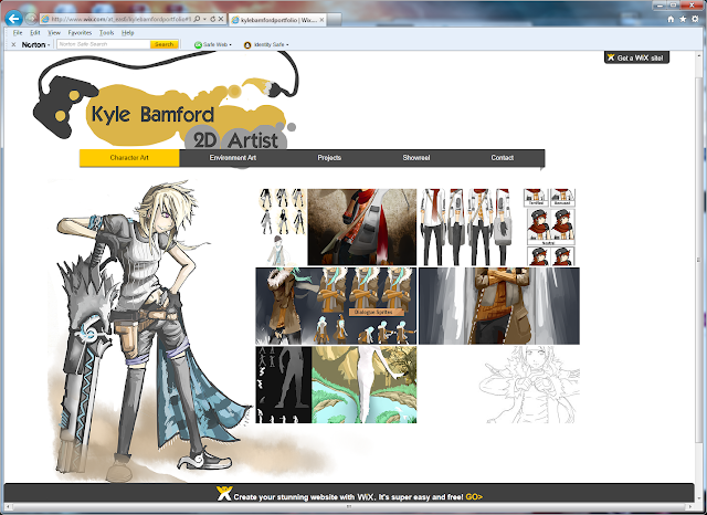
For the actual creation of the portfolio website I decided
to use Wix.com – a free drag and drop style website maker that allows the user to
create galleries of images and import movies among other features. I thought at
first that I might use a free template so I mucked around a bit with that to
get to grips with what I could do with my site before starting again on pencil
and paper to get a simple plan made of how it would be laid out.
The composition, layout and content I considered very
carefully as the phrase ‘’three button rule’’ was used in the introduction to
the brief – essentially meaning that the visitor must be able to get to what
they want to see in three button clicks. By dividing my pages up into Environment
Art, Character Art, Projects and Contacts each section is clearly labelled and
the galleries of images are laid out to abide by the ‘L’ composition to make
the pages each look aesthetically pleasing, with a decorative design in the
bottom left.
 |
| Projects page design |
 |
| Final Version |
When it came to constructing the pages themselves in Wix, I
created or altered existing artwork to make the pages as I went. I also
utilised a dark grey, light grey and a gold colour in order to create theme
between the pages with a strong title at the top (my name and role). The Result
is a little different from my page plan but I think it still retains the
clarity, content and core composition. I still have to create my show reel so
haven’t published the site yet but I will post a finished link when it is
finished.


No comments:
Post a Comment